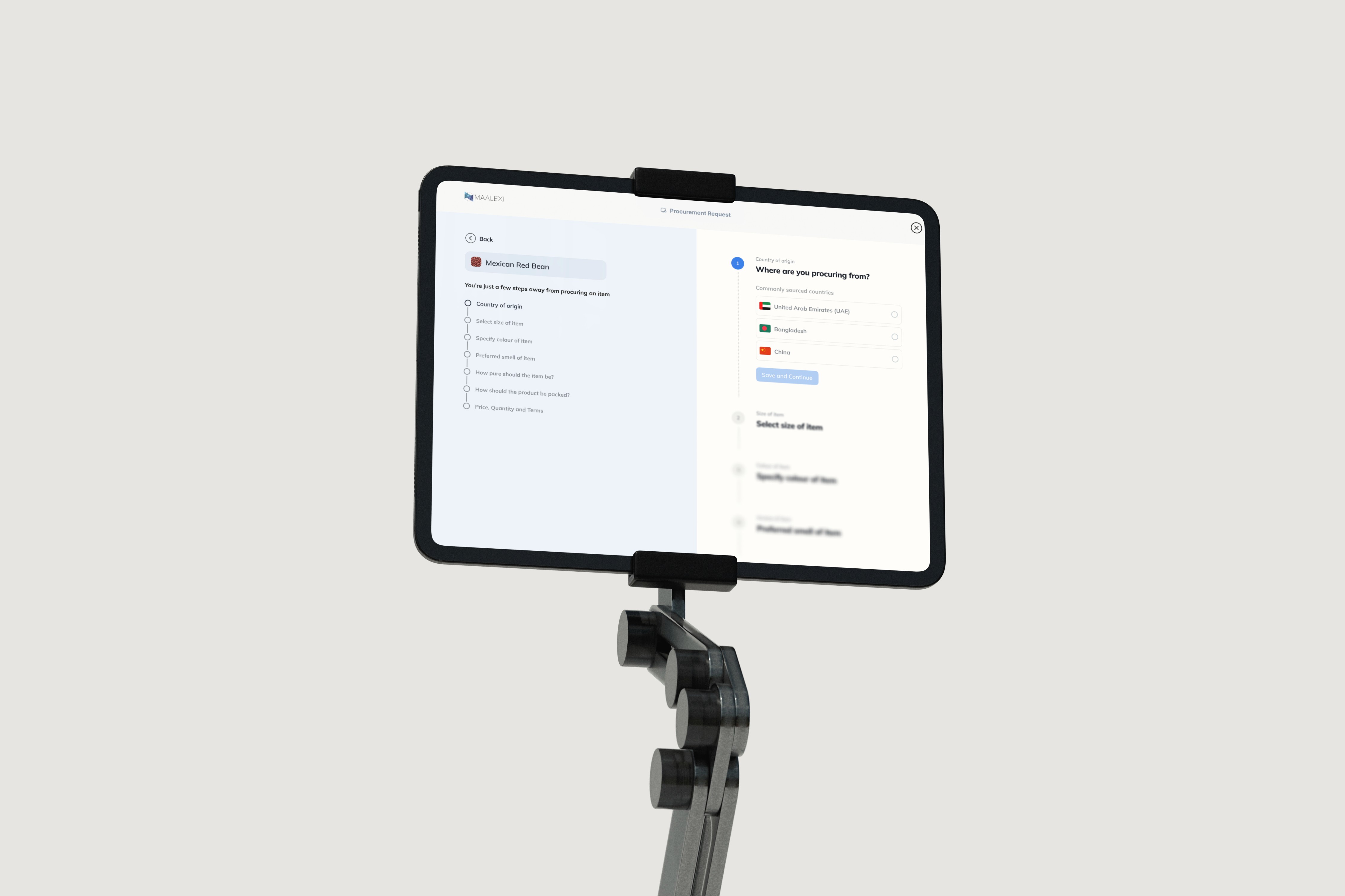
Maalexi is a B2B platform for cross-border agricultural trade, connecting buyers and suppliers across verification, logistics, financing, and fulfilment. I worked on simplifying onboarding, clarifying trade workflows, improving role-based dashboards, and helping users understand what was happening to a transaction without having to decode the complexity behind it.

Cross-border trade has a lot going on before a bag of rice, pulses, or another commodity reaches the person buying it.
There are documents, shipment stages, trade terms, inspections, financing, verification, currency differences, and several people involved in moving one transaction forward.
When I joined Maalexi, the product already supported that business, but the experience reflected much of that complexity back to the user.
Some flows felt fragmented. The dashboard did not always recognise that a buyer and a seller were looking at the same transaction for very different reasons. Registration was long, and Hotjar recordings repeatedly showed people falling away before they reached the part of the product that actually delivered value.
The challenge was not to pretend international trade was simple. It was to stop making users carry complexity that the product could explain for them.
Many suppliers were traders operating in India and other markets where digital confidence varied widely.
They knew their businesses. They understood goods, buyers, shipping, and negotiation. But when that knowledge was translated into unfamiliar platform terminology, dense forms, or unclear transaction states, the product could make an experienced trader feel like a beginner.
That distinction became important to how I designed.
Instead of treating low digital literacy as a reason to remove information, I turned my focus to presenting the right information at the point where it became useful. Trade terms were standardised. Complex ideas were broken down with plain language, illustrations, and visual cues. And where the business had different value propositions for buyers and sellers, the product needed to explain those benefits from their perspective rather than from ours.


Onboarding had grown into a long registration journey.
Like many startup products, new requirements had been added over time. Each one made sense on its own, but together they created a form that felt like it might never end.
Hotjar made the problem difficult to ignore. We could see users moving through the early fields and then disappearing before they ever reached the dashboard.
I started looking at onboarding patterns from direct and indirect competitors and compared how quickly a new user could move from arrival to something useful.
The question became less about:
“How do we fit all of this information into a form?”
and more about:
“What does someone actually need to give us before we can let them move forward?”
That led to experimenting with shorter form patterns and progressive disclosure. We eventually settled for the progressive disclosure collapsible forms.
The next problem appeared immediately after onboarding.
Buyers and sellers could switch between roles, but they did not come into the platform asking the same questions.
Buyer Curiosity Map | Seller Curiosity Map |
|---|---|
A buyer might want to know:
| A seller was more likely to care about:
|
So instead of thinking about “the dashboard” as one surface, I started thinking about it as a shared system with different priorities depending on the role viewing it.


Good design requires sacrifice. Every decision has costs.
Operational Overhead Progressive onboarding improved conversion but created compliance follow-up work. Growth over tidiness. | Engineering Complexity Role-based dashboards required separate queries and permissions. Retention gains justified the technical debt. | Code Quality Building features directly meant some code needed refactoring. Speed over polish in early-stage product. |
Multi-market regulatory complexity: Rather than creating separate flows for each region which would have been costly and slow to maintain, I designed around the strictest shared requirements.
Compliance was introduced progressively, appearing only when relevant to the user’s context. It wasn’t the most elegant solution, but it was practical, scalable, and realistic given the constraints.
Design is a negotiation between competing priorities.You show enough to guide, but not so much that it overwhelms. You verify identity without turning the process into a barrier. You support advanced users without alienating the majority. They are not problems to eliminate, they are forces to manage. The interface is shaped by how well those trade-offs are handled.
Set up tracking earlier. If we had clearer data from the start, we would have seen where users were getting stuck and which form fields made them drop off.
That insight would have helped us fix problems faster and make better design decisions sooner.