Pipped is an HR technology platform exploring a different way to build and maintain trusted talent pipelines.
The product is under NDA, so I have simplified some workflows, metrics and product details. This case study covers the design decisions I can discuss publicly.

Most hiring systems are built around the role that needs to be filled right now.
Every hiring process also produces people who were strong enough to progress and earn trust, and who came close without getting the offer.
The product started from a different question:
What happens to that trust after the role closes?
My role was to take a complex hiring model and make it clear to candidates, hiring teams and the operations team, who each came to the platform for a different reason. Their experience had to feel like parts of one product.
The client already understood what the system needed to do. My job was to translate that into what each person would experience. Three perspectives shaped most of the design decisions.
Candidate
The candidate had already invested time in the hiring process and needed to stay in control of their information and participation.
Hiring-side user
The same person could move between recommending talent and hiring, so the product had to support both inside one account.
Operations
The operations team needed to see what was happening across the platform without being buried in administrative detail.


Hiring products have become good at collecting people. That does not always mean they preserve useful context.
A strong referral can disappear when a role closes. A hiring team can receive more applications and become less certain about who deserves attention. For candidates, an application can still feel like sending information into a black box.
These problems pointed to one principle:
Useful hiring context should survive longer than a single vacancy post.
I looked for ways to keep that context across workflows.
I used these insights below to judge each interaction. The question was whether it made the system clearer without shifting too much control to one side.
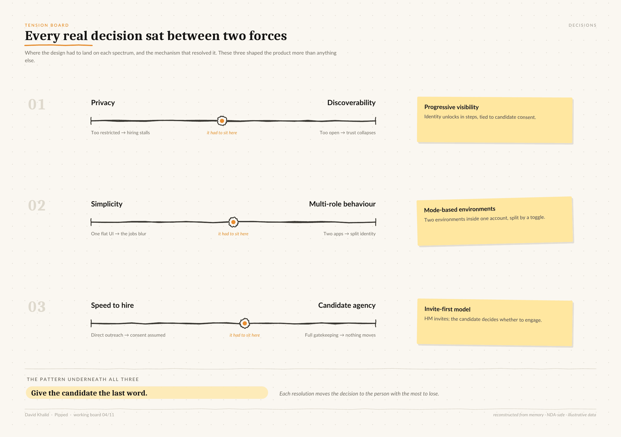
Privacy vs. useful visibility
Candidates needed control over their information, and hiring teams still needed enough context to make a decision.
Simplicity vs. multi-role complexity
Insight from interviews informed me that some users tend to move between referring and hiring. Splitting those behaviors into separate products would have created a different kind of friction.
Hiring speed vs. candidate agency
Making things faster for hiring teams could remove control from the candidate.

The first few minutes had to explain enough of the product without explaining the whole system. What followed was just request for information needed to make the product useful to users.
For candidates, that meant preferences, working conditions, professional information and how much of their profile they were comfortable making visible. Each of these later improved the relevance of the opportunities they saw.
On the hiring side, relevance became a count of matched criteria, such as 5/5 or 3/5. We chose a count over a percentage, because a percentage would make hiring compatibility look more precise than it is.
I followed one rule throughout:
Ask for information when the user can understand what it will improve.
That thinking also shaped how job relevance was communicated.

Candidate behaviour meant mobile could not be a smaller copy of the desktop product.
Hiring teams worked through denser workflows. Candidates used the product in short bursts to check an update, review an opportunity, respond to something or see where an application stood. The work on mobile was deciding what mattered when someone had only a few seconds of attention.
For example:
We kept application progress visible while moving the operational detail out of the primary view.

My discussions with hiring managers made me realize they tend to recommend someone they trusted for a job sometimes or hire for their own team .
I kept both behaviours inside one account and treated them as different contexts. When the intention changed, the priorities, actions and information on screen changed with it as well.
The user should always know what they can do here without having to work out which “side” of the product they are on.

Users, companies, hiring activity, referrals, commercial information and the overall health of the platform all needed some level of oversight. Putting all of it into one hub would have covered everything and been hard to use.
So I organised the admin experience around the questions the operations team needed answered. For each section, I considered what the team needed to understand or act on there.
The overview showed a small set of high-level signals so someone could read the state of the platform quickly. Deeper information sat in the part of the system where it became useful.
That gave the team enough visibility to spot movement, exceptions or problems without scanning every piece of activity at once.

High-level numbers were useful, but they did not show where attention was needed.
The deeper operational views focused on client and candidates movement. For referrals, that meant showing whether something was still waiting, had progressed or had reached an outcome. For hiring activity, the same idea applied to open work and candidate movement.
The states differed, but each view showed where something was now, what happened before it and where intervention might be needed.
This helped the operations team find stalled activity and decide what deserved attention without opening every record.
Bringing the system together
Pipped had to work for three groups at once. Candidates needed to see their progress, hiring teams needed enough context to make a decision, and the operations team needed to see where activity had stalled.
Most of my work came down to deciding what each of them needed at a given moment.
A complex system can still feel clear when the interface knows what not to show yet.