Gupa is a responsive travel platform that brings discovery, planning, booking, and local experiences into one connected journey. Rather than asking travelers to jump between separate tools for stays, activities, and recommendations, the product was designed to help them narrow their choices, plan with more confidence, and keep the different parts of a trip connected.

Gupa already had people arriving on the platform, but that attention was not turning into meaningful activity.
Travelers would browse, look around, and leave without completing much. At the same time, local vendors were not getting enough useful engagement from the people already visiting the product.
That made the problem bigger than simply redesigning a booking screen.
The traveler experience and the vendor experience were connected.
If planning felt fragmented or exhausting, travelers abandoned the journey. If travelers did not stay engaged, local providers had fewer opportunities to be discovered or booked.
So the work started with a simple question:
What was making people interested enough to browse, but not confident enough to continue?
The travel market already had strong products like Booking.com, Airbnb, and TripAdvisor.
But the planning experience itself was still fragmented.
A traveler might use one product for flights, another for accommodation, another for reviews, and something else entirely to find things to do once they arrived.
The more tools involved, the more decisions had to be repeated.
From the research and product review, three recurring problems stood out:
Fragmented planning: important parts of the trip lived across separate products.
Decision overload: travelers were presented with plenty of options, but not always enough help deciding what actually suited them.
Trust: hidden costs, inconsistent information, and uncertainty around local offerings made people hesitate before booking.
The opportunity was not to compete by giving travelers even more choices.
It was to help them make fewer, better decisions.
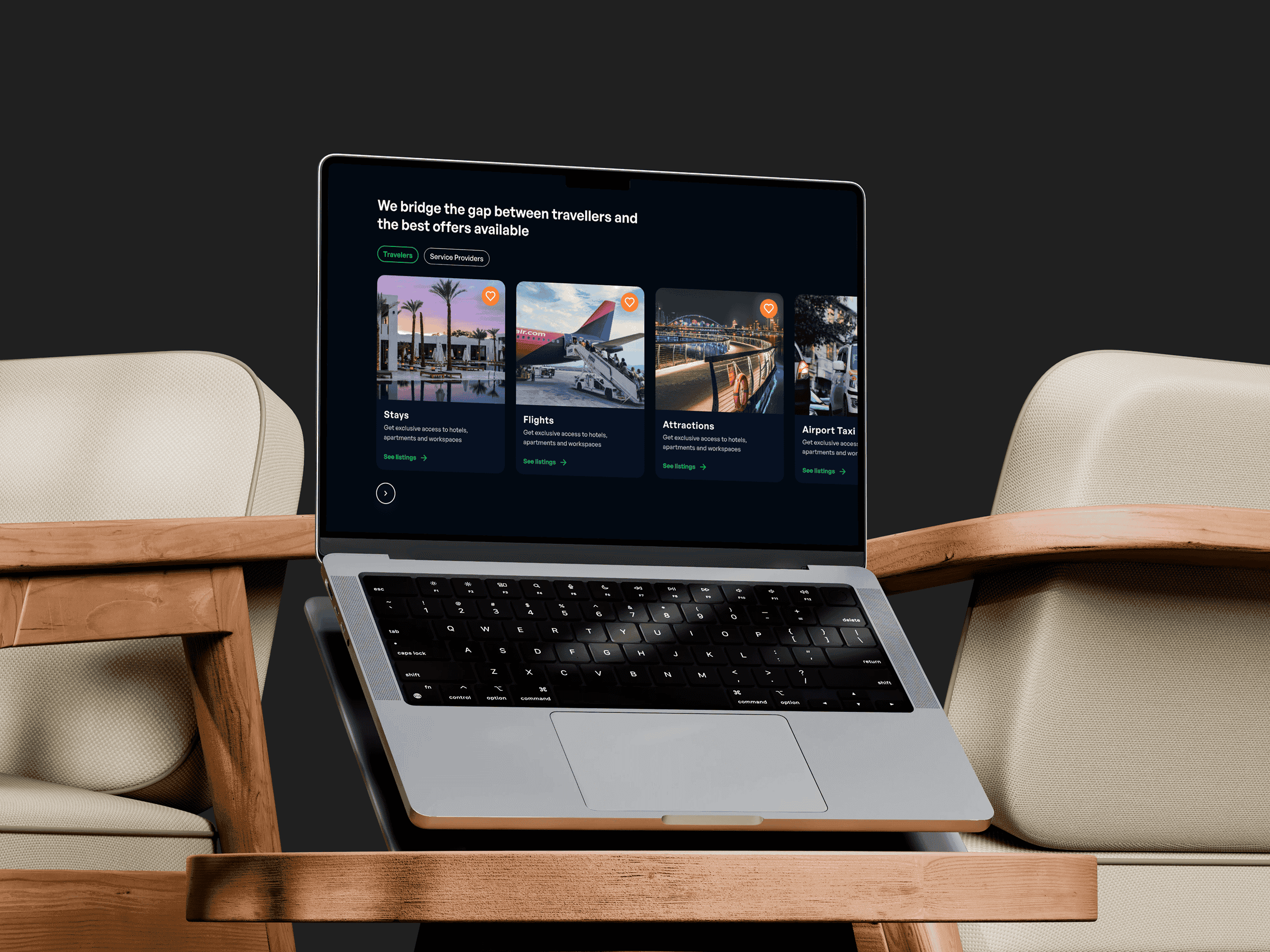
The initial hypothesis was straightforward: if Gupa could bring more of the travel journey into one platform, planning would require less jumping around.
But consolidation alone would not solve the harder problem.
A large catalogue inside one product could still leave someone staring at hundreds of hotels, activities, and experiences with no clearer idea of what to choose.
So the direction became more specific.
We wanted Gupa to do three things well:
Connect the journey: move from inspiration into stays, activities, and booking without making each stage feel like a separate product.
Use intent to reduce noise: tailor recommendations around what the traveler actually cared about, including budget and preferences.
Keep local experiences visible: make smaller providers part of the trip rather than something travelers had to discover somewhere else.
One of the harder decisions was how much Gupa needed to know before it could be useful.
Better recommendations depend on information: budget, interests, travel style, dates, who someone is traveling with, and what kind of experience they want.
But asking for all of that too early could make onboarding feel intrusive.
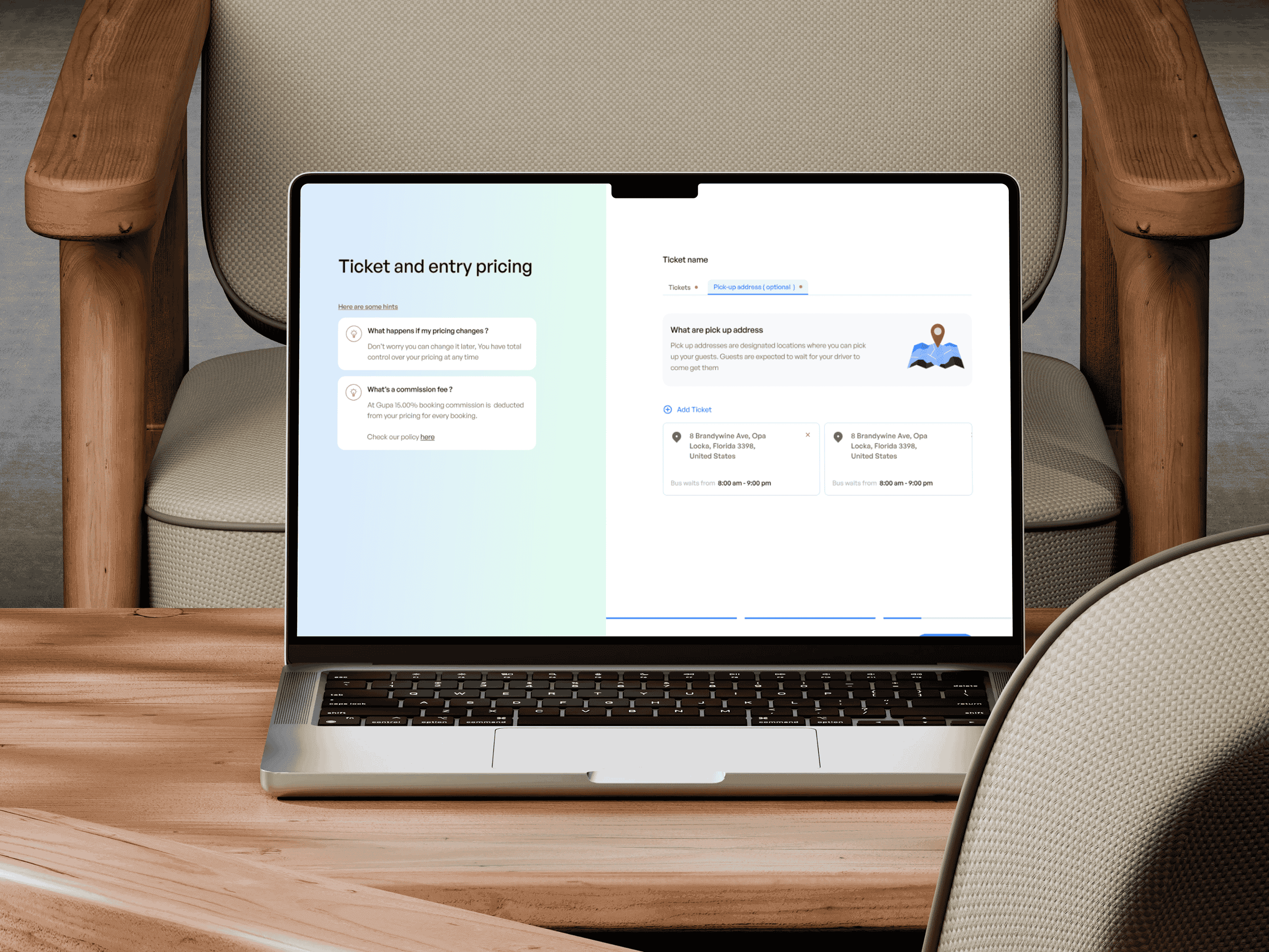
On the other side of the marketplace, local vendors had their own friction.
Their onboarding was already complex, managing pricing and availability could become difficult, and smaller providers risked being buried beneath more established listings.
That meant we were balancing two different needs at the same time:
Travelers wanted less work before seeing something relevant.
Vendors needed enough control and visibility for their offering to actually compete.
The product had to collect enough structure to make the experience useful without turning either side into an administrative task.
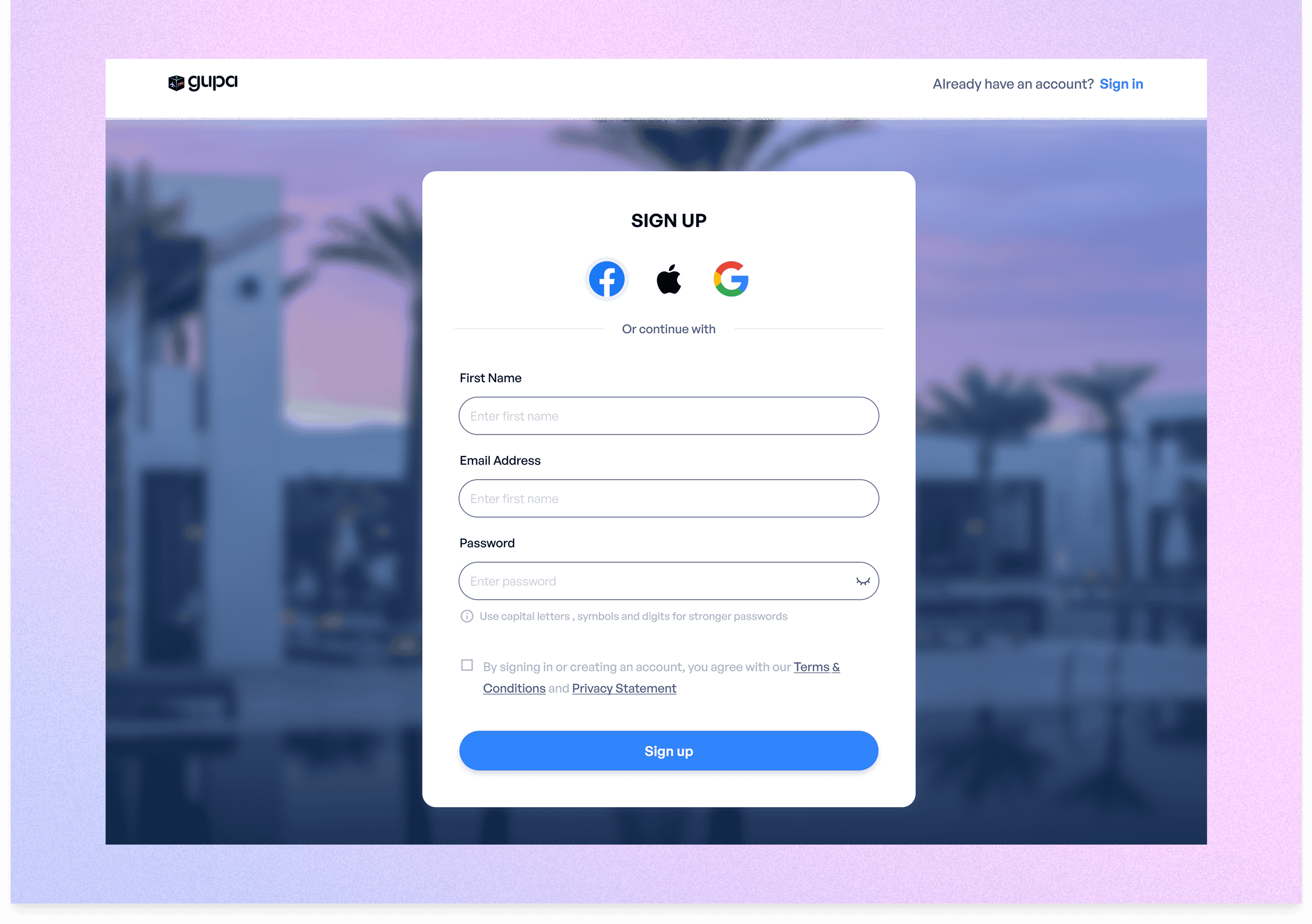
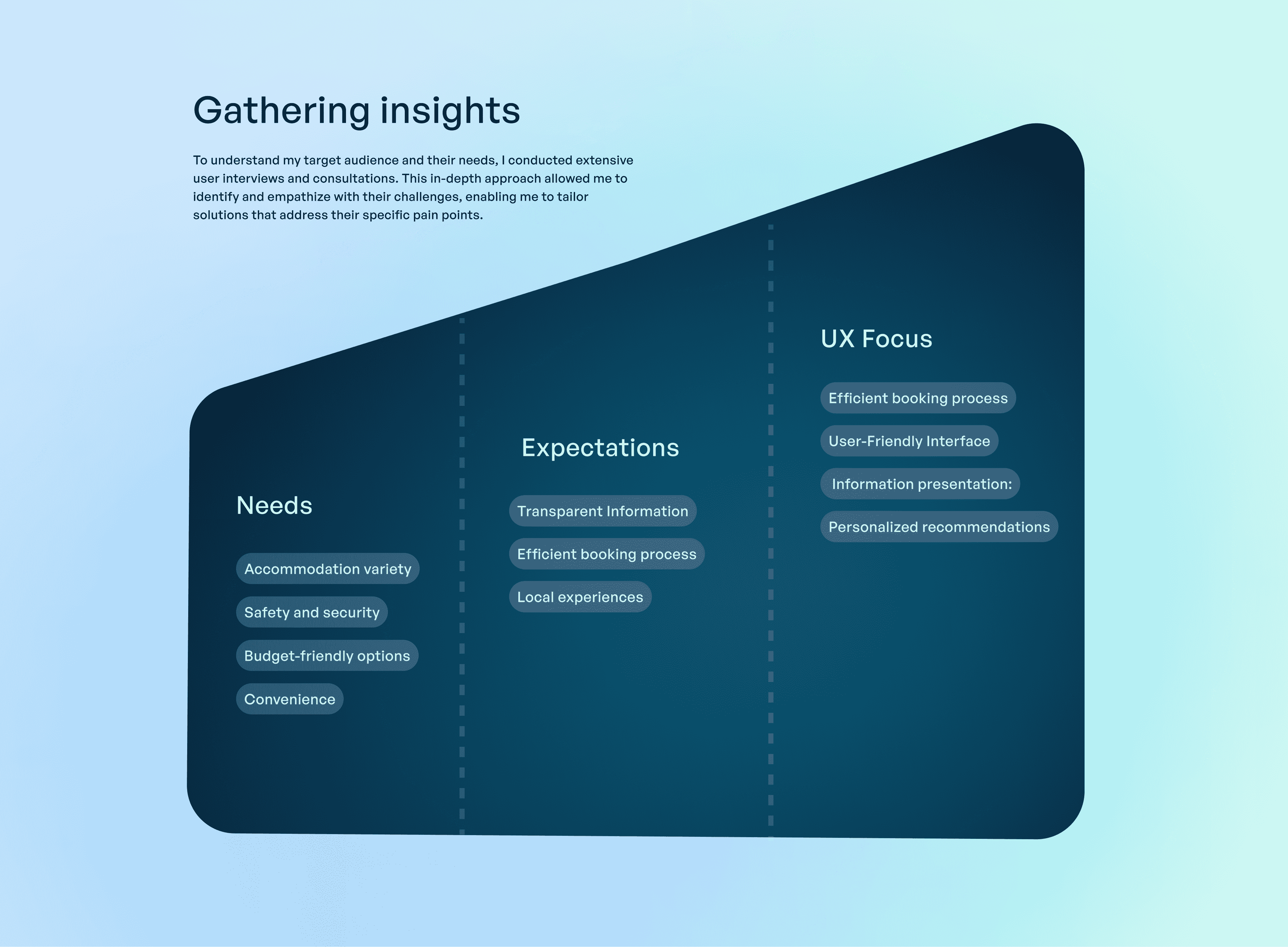
A large part of Gupa’s value depended on local providers — hotels, hosts, guides, transportation services, and activity operators.
But simply allowing anyone to list something would not guarantee consistent pricing, service quality, or a good traveler experience.
That led to the E-Concession model.
Instead of treating every provider as an isolated listing, the model created predefined partnership structures that could govern how local services appeared and operated within the platform.
The idea was to give smaller providers a clearer route into Gupa while giving the product enough structure to maintain a consistent experience.
It also supported something important to the original product idea:
local experiences should not feel like an extra feature added after the hotel booking.
They should feel like part of the trip.
Rather than treating every feature as its own destination, I organised the UX around the decisions travelers repeatedly make.
Discovery had to feel personal enough that users were not scrolling through endless irrelevant options.
Recommendations could respond to things like preferences, budget, travel history, and intent.
Planning needed to connect different parts of the trip.
A traveler should be able to move between accommodation, activities, and experiences without repeatedly rebuilding the context of the journey.
And booking needed to feel trustworthy.
That meant making pricing clearer, surfacing useful reviews and information, and reducing the number of moments where someone had to second-guess what would happen after they committed.
The strategy was less about inventing new travel behaviours and more about removing the unnecessary gaps between the behaviours people already had.

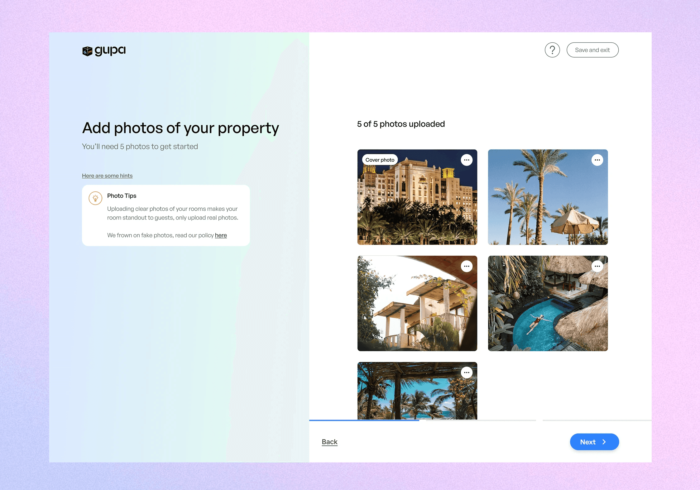
The problem was not that travelers lacked options. It was that too many of those options felt equally important.
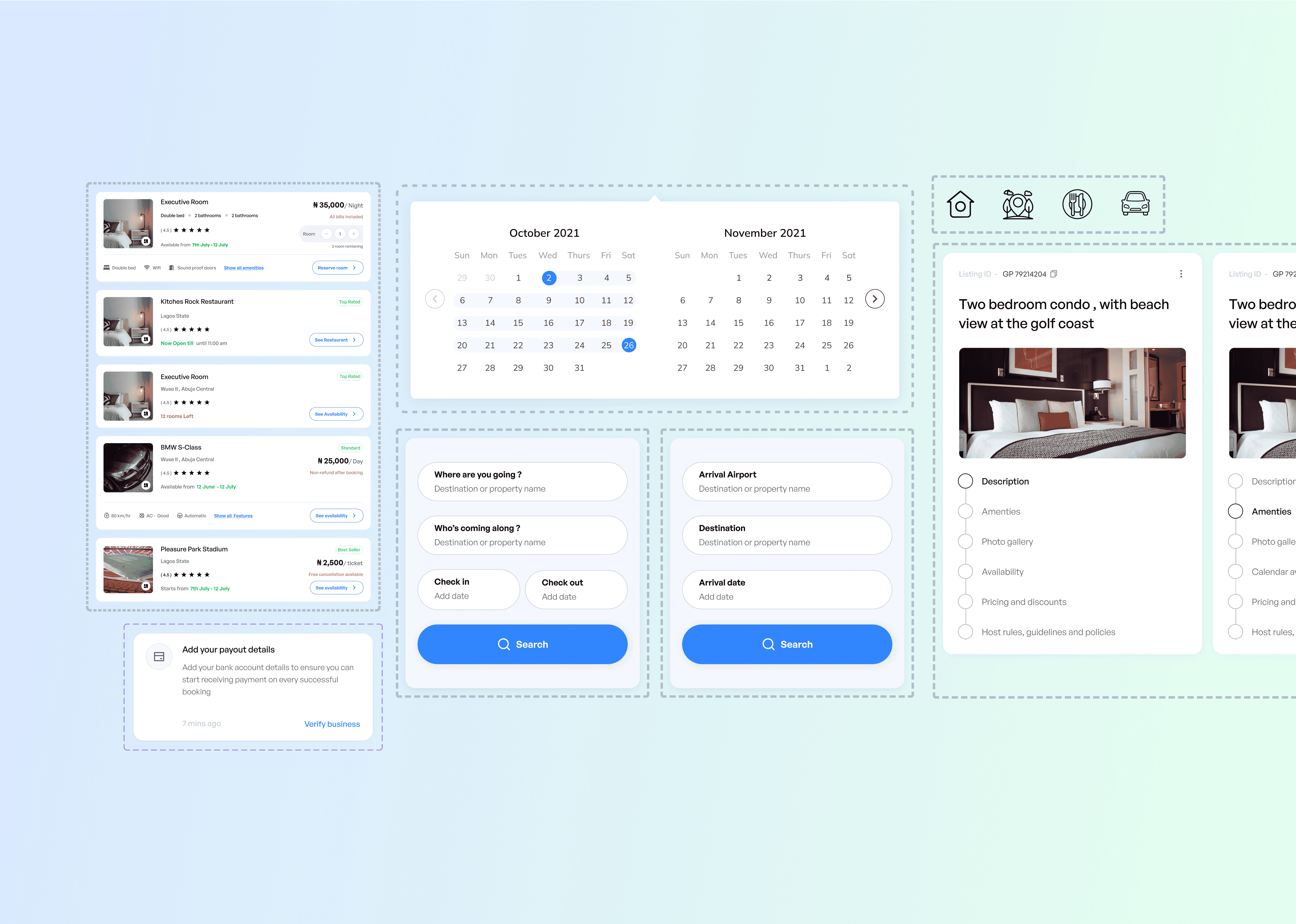
So instead of starting with a broad search and leaving people to sort through everything themselves, Gupa used a more guided discovery flow.
Early preferences like destination, budget, travel style, and group size helped narrow the experience before the user had to make bigger decisions.
From there, category-based browsing and quick filters gave people different ways to explore depending on what mattered to them — whether that was family-friendly stays, nearby experiences, affordability, or something more specific to the trip.
The aim was not to make search feel more advanced.
It was to make it feel like the product understood what the traveler was actually trying to find.
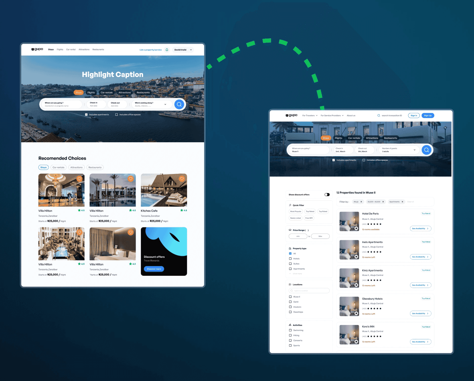
The problem with travel planning was not that people could not book things.
It was that every new booking often felt like starting again.
A traveler might find a stay on one platform, open another tool for activities, then return to email or notes to work out what had already been confirmed.
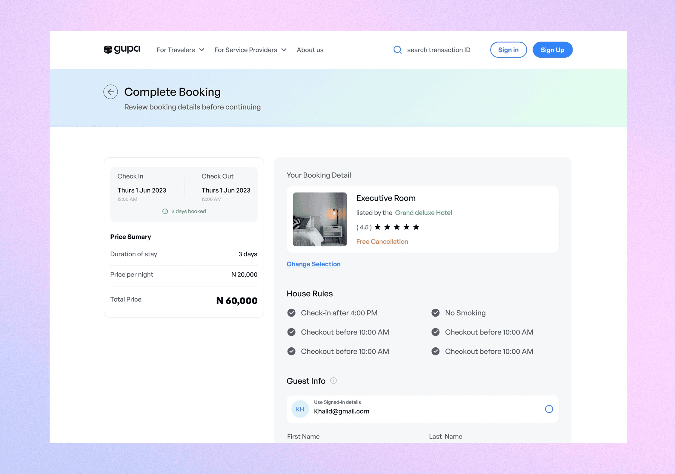
Gupa brought those steps into one connected flow so travelers could discover, compare, and book different parts of the trip without repeatedly leaving the experience or re-entering the same context.
That continuity mattered more than simply putting several booking categories on one screen.
The goal was to make accommodation, activities, and local experiences feel like parts of the same journey.
For vendors, that same structure created a clearer connection between availability, bookings, and the travelers already using the platform
Travel decisions involve a lot of uncertainty.
Is the price really the final price?
Do the photos reflect what is actually there?
Are the reviews useful?
What happens if something goes wrong?
Those questions become even more important when the platform is introducing travelers to smaller or less familiar local providers.
So trust could not sit in one badge or one review score.
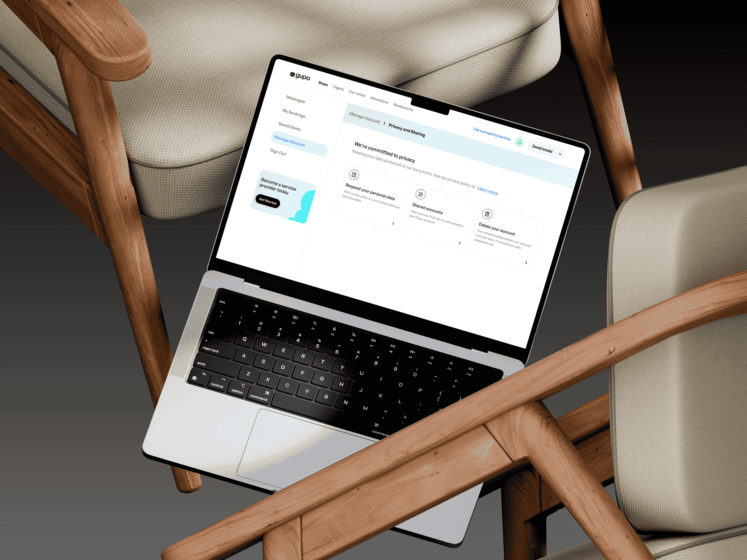
We treated it as something the experience needed to reinforce across the journey through clearer pricing, verified reviews, useful listing information, and cost breakdowns that showed what a traveler was actually paying for.
The aim was not to tell people, “Trust this listing.”
It was to give them enough information to make that judgment themselves.
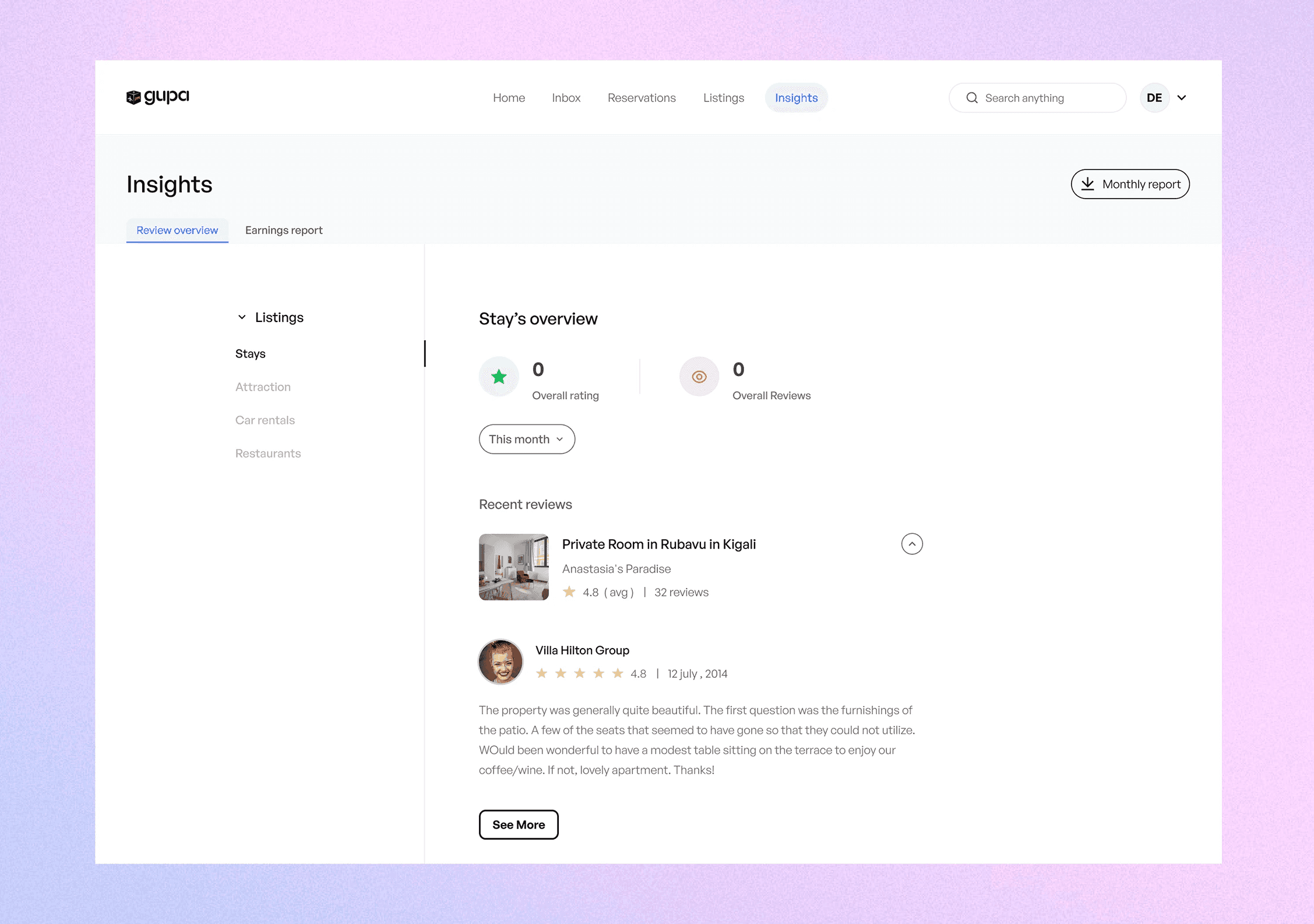
For local providers, that transparency worked in the other direction too. Strong reviews, clearer pricing, and complete listings gave credible vendors more opportunity to stand out instead of competing only on visibility.
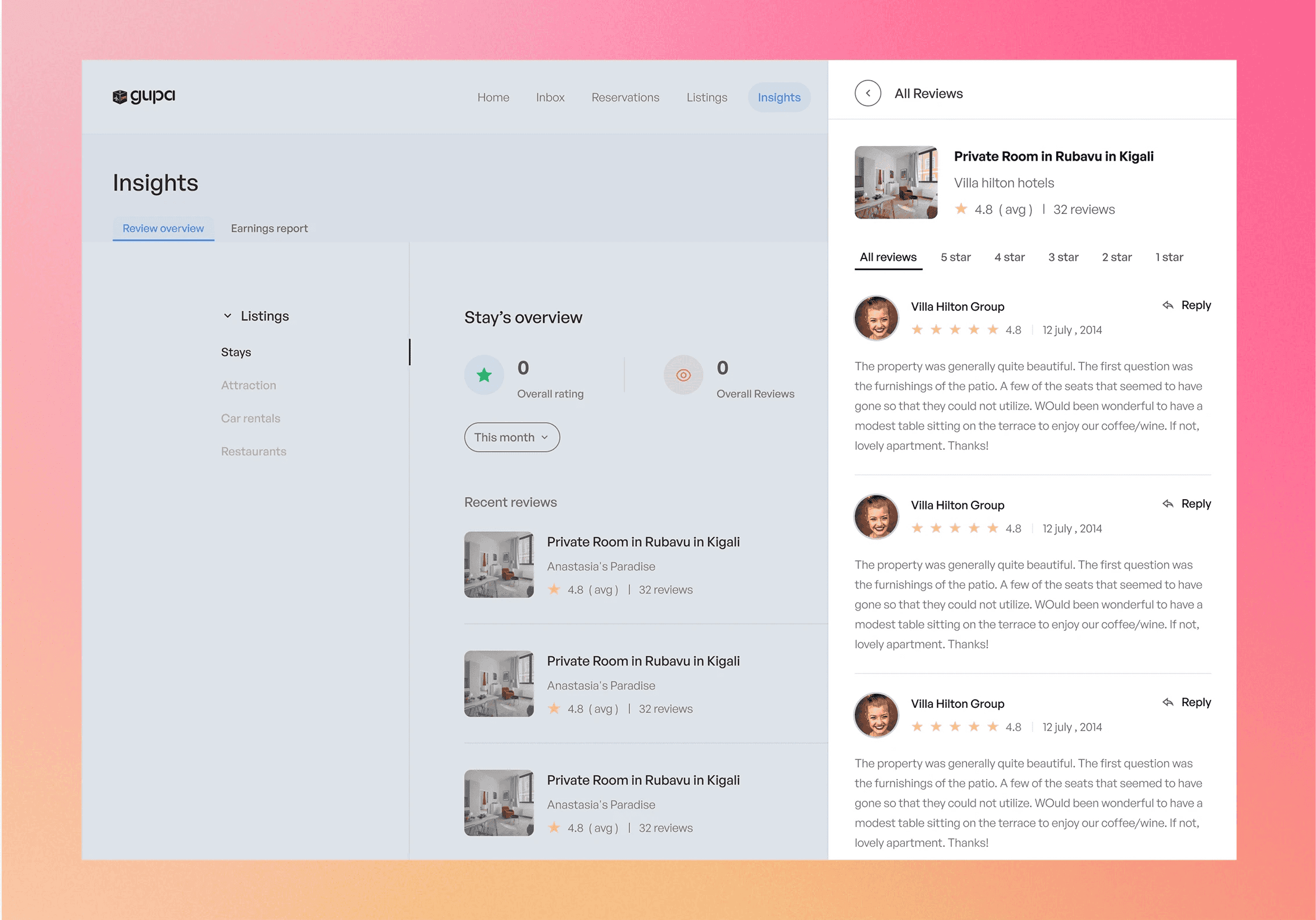
A lot of travel products become much less useful once the booking is complete.
For Gupa, I wanted the dashboard to keep supporting the traveler after that moment.
It brought together the things someone needed to remember — booked stays, activities, itinerary details, reminders, and other parts of the trip — instead of forcing them back into emails or separate confirmation pages.
Personalisation also became more useful here because it had context.
Once Gupa understood what had already been booked and how the traveler was using the platform, it could surface relevant nearby experiences, useful additions, or changes without making the dashboard feel like another catalogue.
The goal was for the dashboard to feel less like a transaction history and more like the place the trip continued to live.
That also gave vendors a longer relationship with the traveler. Their relevance did not have to end the moment the first booking was made.
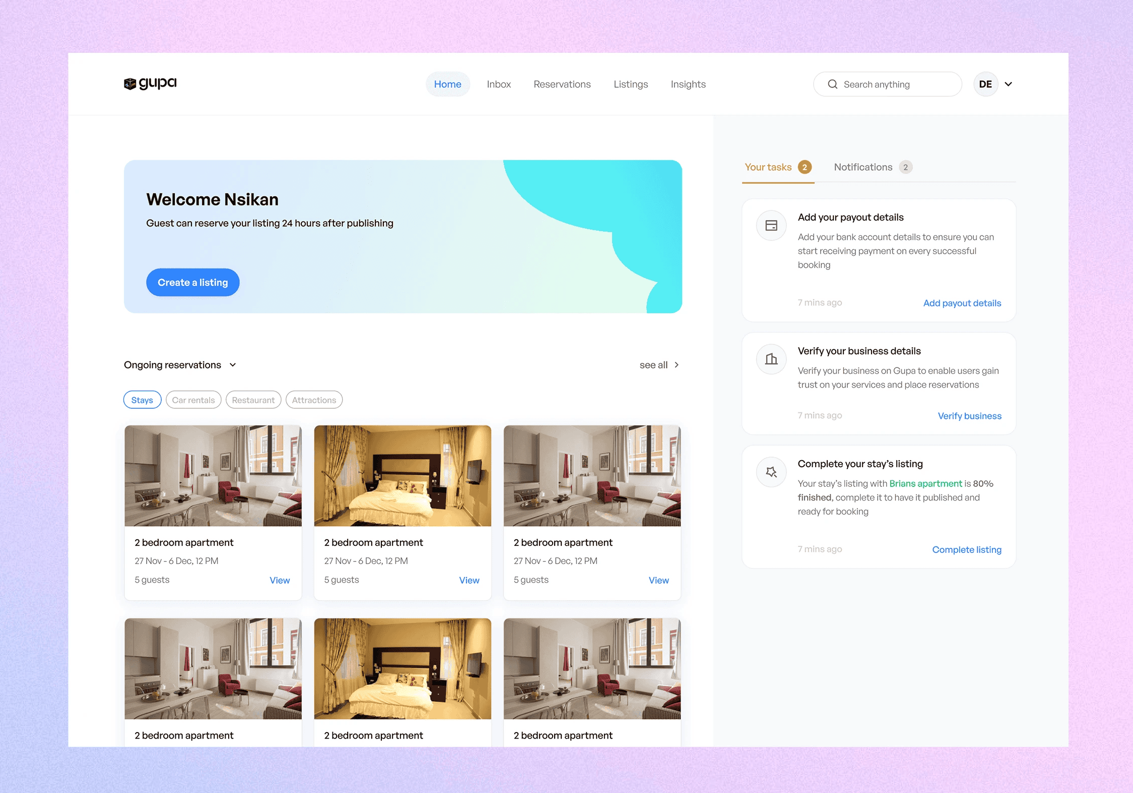
Reduction in trip planning time through guided recommendations and a seamless booking flow.
Increase in conversion rates, with more travelers completing end-to-end bookings in a single session.